As more and more tasks and projects are transacted via online platforms and apps, national governments and statistical agencies face increasing challenges in tracking the growth of this phenomenon. To address this, we have created the Online Labour Index (OLI) and its new Worker Supplement. This post explains the methodology behind the OLI Worker Supplement.
Sampling
The raw data is collected by periodically sampling workers from four major online labour platforms: Fiverr, Freelancer, Guru, and PeoplePerHour. Each platform is sampled once every 24 hours. We collect information on each worker’s home country, occupation category, and when they last completed a project. We then use these samples, weighted by the number of registered workers on each platform, to calculate the total number of currently active workers on all platforms. It is entirely possible that many of the registered users are no longer active, which might bias the weights. To account for this, we also experimented with an alternative weighting strategy, where we weighted the samples by platforms’ traffic numbers reported by Alexa. The resulting weights were very close to the weights calculated from registered user counts.
All in all, there are roughly 3.5 million registered users on the four platforms. From this population, we see that approximately 100,000 workers work at least once in any given week. Since our measurement does not cover the universe of all platforms, the total number of online workers is likely at least twice that amount globally.
Sampling human populations from the Internet differs from sampling from traditional populations in one crucial matter. Namely, when sampling from the Internet, the underlying universe of individual workers is unknown. Therefore, we cannot ascertain the representativeness of our samples by comparing the properties of the sample to the properties of underlying population as one could do when sampling from a census. This might be especially problematic if our goal was to find out properties of the population of registered users on platforms. Since our interest is in sampling active workers on platforms, we conjecture that, if anything, our samples will be skewed towards the more active workers.
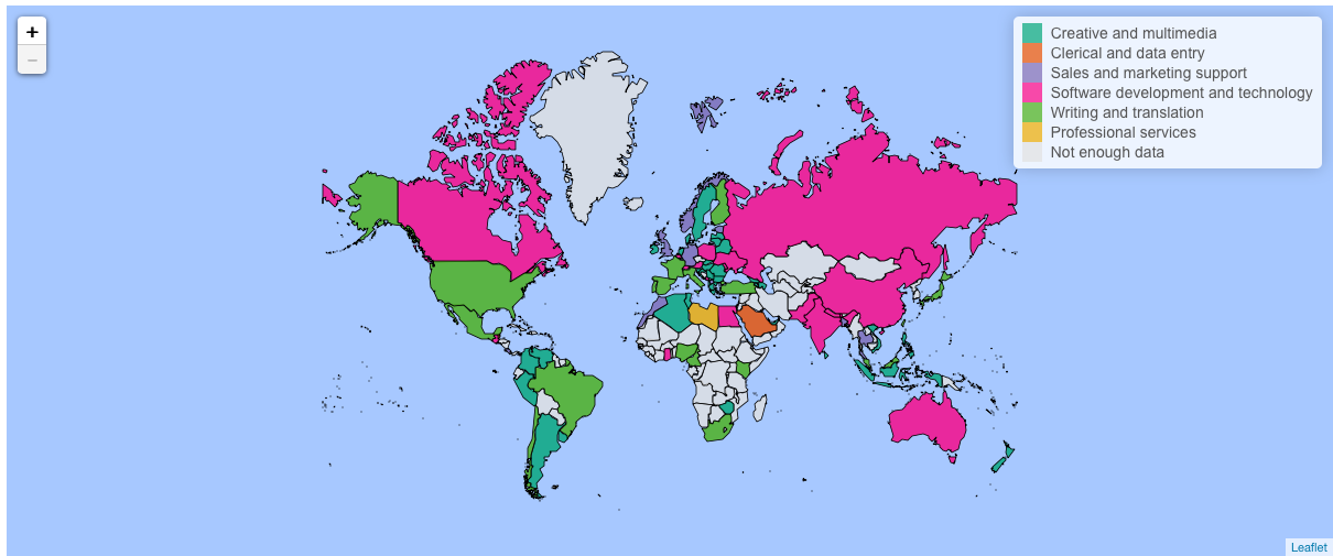
Classification
We define as ‘currently active’ anyone who has completed a project over the last 28 days. Averaging over the last 28 crawls allows us to reduce the number pages we query over individual rounds of crawling, thereby reducing the burden of our data collection to the platform operators while at the same time reducing fluctuations from small samples.
If we find workers who are doing more than one type of projects, we count them in all of the occupation categories they have worked in. In other words, if the same worker has done both software development and writing tasks over the past seven days, they will appear in both software development and writing categories. In practice this is rare, however, and does not result in significant double counting.
Our definition of ‘currently active’ is adapted from the standard ILO definition of ‘currently employed, which is used by most labour market statisticians. According to the definition, a person is classified as employed if he or she are gainfully employed for at least one hour in the survey week. This definition is adopted to increase comparability to traditional employment statistics. Nonetheless, the definition comes with a caveat: it is not possible to separate part and full time workers from one another. This limitation stems from the data – we are usually not able to infer individual working hours from the data we collect. But the definition is useful in that circumvents the problem of comparison between projects of different sizes. For instance, completing a programming project might take ten times as long as completing a data entry project.
Presentation
The number of workers in each country and occupation is then presented as a percentage figure (share of the total number of workers) in our visualisation. The reason we show percentages rather than raw worker numbers is that the raw numbers are only a sample, and not the total market. In a later post we will use our data to make some estimates about the absolute numbers.
The interactive visualisation is automatically updated with the latest data, and the data are also available for download from Figshare. We hope you find the data useful, and welcome all questions and comments; one way to reach us is via Twitter.